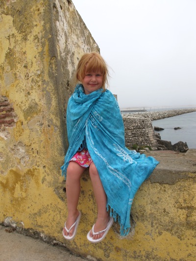
I wouldn't normally give this sort of image a second glance:

There is little contrast, Caitlin is lost in a dull, lifeless sky...
And yet, I have spent the last two evening following a couple of Webinars by OnOne Software, so I thought I would use this as a 'test image' to see what I had learnt.
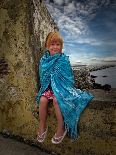
I used two tools - Phototools 2.5 - Which allowed me to brush in the contrast that I wanted, and generally make the image somewhere close to where it should be, but I still had the lifeless blown-out sky.
In steps MaskPro - Wow! Simply select the colours to keep (lots of yellow, brown and blue in this case, and tell it which ones to loose (lots of white for the sky).
Then I added a sky from one of my other images on a new layer, and brushed the two together...

Really please with the result - OK, still not a 5* image, but one I will certainly be keeping.
I painted a little lightness into Caitlin's face, and added a very slight vignette to finish things off a little and voila.
